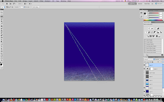
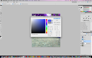
This is a demo we followed today on creating our own underwater scene from three images found on the web that were given to us by our tutors, to start off with we opened up all three images in Photoshop,
We then set the adjusted the Hue/Saturation by selecting the background image and alt clicking the black and white circle symbol below the layers then selecting Hue/Saturation, we then inputted numbers given by our tutor so that the colour of the gravel in the background image to act as a seabed.
We then created a new layer, selected a nice blue colour, then using the "Gradient" tool with "Foreground to Transparrent" set we created what is shown in the screenshot below,
We then created a reflection to go at the top of the water by creating a new layer then with two different shades of blue selected we drew another gradient this time without foreground to transparrent set,
We then added the ripple effect to it by going into "Filter" then "Distort" then "Glass" and set the distortion to 20 and the smoothness to 5,
We then flipped the layer and distorted it like so,
The next step was to create some detail within the image by making some plankton, to do this we created a new layer,
We then jumped into "Filter" "Noise" then selected "Add Noise" then set the amount to somewhere around 170% and ticked the box "Monochromatic"

The next step was to create a light source that looks as though it's coming from the surface of the sea, to do this, we firstly created the outline of the light using the "Polygonal Lasso" tool
We then filled in the selection we made using the "Fill" tool then adjusted the opacity to our liking, we then (optional) duplicated the layer to create a second light source then using the "Free transform" tool to adjust it
We then made the image of the sunken plane fit nicely into the background of the underwater scene by adjusting the blending mode to the one that suited it best,
The final step was to then make the shark image fit in with the rest of the piece, to do this we created a layer mask and inverted it by using a white brush instead of black which makes the background of the image dissapear
This is the final outcome of the demo, all in all - I really enjoyed this demo as it was different to the demo's we usually follow, I liked the way that the piece ended out looking real with so much detail within just by using effects and tools etc in Photoshop.


1) You should have more comments of the views given by tutors and peers.
ReplyDelete2) You could expand on your findings in more details such as using different sources (ie: books, and magazines)
3) Highlight the issues related to the motivations of artists and/or the message behind his/her work.
4) Show strong evidence of references and make sure all your researches are referenced.
5) Develop more evidence of timescale and to highlight any changes made to the initial planning and explain why.