I then moved onto looking into Worth1000 which was filled with bizarre and whacky designs which I think are very interesting, many of the contests briefs allow the designer to be very creative in what they produce and the finished pieces, from what iv'e seen, are brilliantly creative.
Cubism 10
"In this Shape contest we give you a shape - cubes ( or squares and rectangles) - and you have to integrate it into your entry by altering another object's shape, as in the themepost.
The rules of this game are thus: You are to integrate a cube, square or rectangle shape into your image by altering another object's shape. As always, quality is a must. We will remove poor entries no matter how much we like you."
The rules of this game are thus: You are to integrate a cube, square or rectangle shape into your image by altering another object's shape. As always, quality is a must. We will remove poor entries no matter how much we like you."

Celebrity Mimes 3
"A mime artist is a performance artist who acts out a story in complete and utter silence. Perhaps you've seen a mime performing on the street in a city somewhere, trying desperately to find a way out of the invisible box it's trapped in. Mimes typically wear black and white clothing, with their faces painted simply in white with black accents on their eyebrows and around their eyes. They're quite beautiful actors, really... although I doubt we'll see a modern movie featuring mimes any time soon. The whole silent acting thing isn't something you'd think our typical celebrities would be capable of, anyway.Until now.
For this contest, we want you to show us celebrities as mimes, as our themepost demonstrates. You may use characters that actors/actresses have portrayed, if you wish, or simply the celebrities themselves. Let's see them as the strong but silent types. Invisible boxes are optional".

"Wile E. Coyote. Super Genius. Unfortunately, his vast intellect didn't seem to help him much in catching that roadrunner. It's time we showed him how it's done.
In this contest, you are being asked to design a contraption for catching (or killing, for you Elmer Fudd types) a roadrunner. It can be the realization of a trap featured in one of the Warner Brothers cartoons, or a new methodology you invent yourself. The more complex and outrageous the better. You don't have to actually show the roadrunner or coyote - just make sure the voters can figure out how your device is intended to work."

Fish Tales 4
"Come on, we've all been guilty of telling a little fib now and then... Exaggerating how hot our ex-girlfriend was, how fast our car went or how big that fish we caught was. We weren't lying. Honest.
Remember when I balanced a bicycle on the end of my nose? Remember when Uncle Bob sang on stage with the Beatles? Remember when grandma climbed the Empire State Building? Everybody has heard a few tall tales from their father about how he used to chase mastodons or how it was so hot one summer that the floor melted his shoes. How about putting those stories into an image?
The rules of this game are thus: Take any fib that one would tell a friend and make it reality. (i.e. I once lifted a car, or I caught a giant squid, or I once bench pressed 1500 pounds)".

My Entries
Fish Tales 4
(Advanced)
For my first and second entry I used the website http://www.worth1000.com/
"The biggest lies you've ever had,
Come on, we've all been guilty of telling a little fib now and then... Exaggerating how hot our ex-girlfriend was, how fast our car went or how big that fish we caught was. We weren't lying. Honest.
Remember when I balanced a bicycle on the end of my nose? Remember when Uncle Bob sang on stage with the Beatles? Remember when grandma climbed the Empire State Building? Everybody has heard a few tall tales from their father about how he used to chase mastodons or how it was so hot one summer that the floor melted his shoes. How about putting those stories into an image?"
Source Images


I decided to create a scene that gives a dramatic effect but at the same time original and classic, i gathered some inspiration from the idea of King Kong attacking the city but instead use a different image, after searching for the right monster to fit the scene I found this,


I then imported the image into the background image,
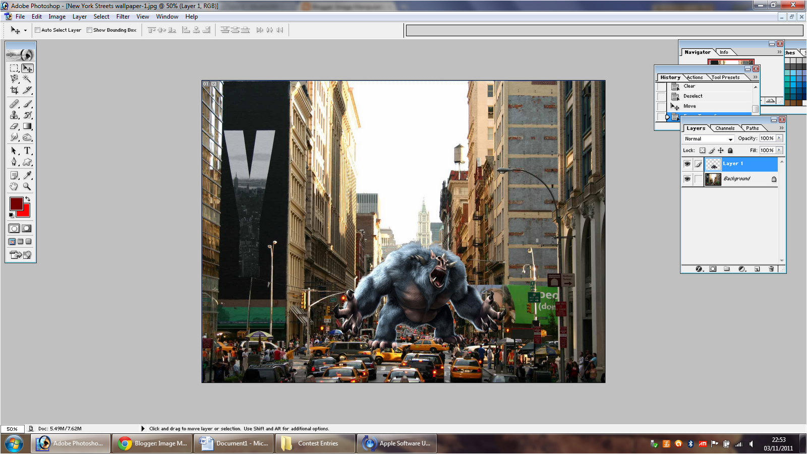
I showed my basic idea to a peer and they suggested to create a rippled effect on the cars below the monsters feet using the "Liquify Tool", so I took this idea on-board, using the "Liquify Tool" with a very light brush pressure of around 15 I started to create the effect by dragging parts of the cars in a downwards motion,

I then created a shadow for the monster by duplicating the layer then filling it in black, and lowered the opacity to scale with the shadows in the source image. The next step was to scale and rotate the shadow according to where the sunlight was coming from in the source image.

The final step was to blend the two images, I used an inner shadow on both the source and the monster image, this made both images blend well together and helped to bring them to life. I then merged all the layers and added a slight tint of yellow from the variations tab which helped to top off the piece
This is the finished piece,

11th place
0:49

Animal Clown 9
(Beginner)
The brief of this contest was to manipulate an image of an animal into a clown, I decided to use a close up image so that a simple background would be suitable, and that way I could focus on creating the most detail on the subject.
Source Images


I started with this image,

I then gave the image some detail that would match the brief by importing this image of a neck ruff that clowns supposedly wear into the original image,

I removed the background of the imported image using the "Magic Wand" tool, I had no trouble doing this because of the two colours being very opposite. I then used the "Dodge" tool around the edges so that it blended with the original background.

After searching the web for some sort of clown hat or wig that would suit the cat I came across this, which was perfect for the image, I then adjusted the hat to fit on the cat's head using the "Free Transform Tool" I also did a horizontal flip on the imported image, lastly, using the "Blending Options" I created a drop shadow just below the rim of the hat,


I then added some detail by creating some shapes using the "Shape Tool" to act as face paint like clowns have , I started by adding the diamond shape on the left eye then changing the colour to white, I then lowered the opacity so I could see the eye below it and erased a hole in the middle, I then created a half diamond, coloured it black and duplicated it for the right eye. Lastly I changed the colour of the cats nose by using a red brush just slightly larger than the actual nose, clicking once and then erasing the access colour around it.

I didn't have many ideas of how to improve this image further so I asked a peer for some suggestions, they thought of adding some minor details to help spice up the image as it was looking a bit dull, after some thinking and searching the web I came across this image of some juggling balls which would be perfect,

I Imported them into the piece and scaled them down to size using the "Free Transform Tool" and added a drop shadow using "Blending Options"

Lastly, I added a yellow variation to image so that all the layers would blend together to fit the scene,

6th place
Although this was a good, simple and straight forward process; I didn't enjoy it as much as I thought I would of, even though the name of the contest was called animal clowns! It lacked creativity, the last contest I entered, (Fish Tales) all the entries were very different and there were some great ideas whereas with this one most of the finished pieces were the same but with some different minor details. But overall, I am happy with my result, If I were to do this again I would of created a background with lots going and lots to look at as I think this was a bit bland.
Striped Hut
(Beginner)
The rules of this game are thus: Manipulate this image in any way you like,


My idea was to create a fantasy based image with lots of different lighting effects and glows to help make the piece catch peoples eyes, after looking into some different artists that create these amazing images I came across this piece which gave me a starting point as to what create.
I think that the idea of the portal is great and I can re-create this in my competition entry using the striped hut as some sort of gateway,
Source Images
These are the source images I used for this entry which I found on the web and using the website http://www.cgtextures.com/
These are the source images I used for this entry which I found on the web and using the website http://www.cgtextures.com/


I started by opening the theme post image in Photoshop, I then cut it out using the pen-tool, this took some time but wasn't too hard because of the flat edges and sides.

I then opened up this image of an ancient staircase, the next step was then to find a suitable background. To create a fantasy styled image the background would have to be a landscape view that the stairs could look over. I then added a "reveal all" layer mask to the staircase image and removed all the parts of the image where I wanted the fantasy landscape to show through, this was very fiddly and took a very long time as I had to go inbetween all the branches.

I then imported this image of a fiery pheonix then adjusted the blending mode so that it scaled with the rest of the piece, I then added a layer mask and with a low opacity and soft brush removed some of the access background around it. I then changed the brightness and contrast and scaled it down to size then placed it above all the present layers,

Next, I imported this image of a crow and removed the background using the "Magic Wand Tool" I then scaled it down to size and placed it at the bottom of the staircase, using the "Blending Options" I added an inner shadow. I then duplicated the layer and filled it black, added a Guassian Blur and lowered the oapcity then flipped and distorted it. I also added some shading using the Dodge & Burn tools.
Lastly, I added a few lens flares to help emphasise the fantasy landscape and added a lighting effect using the "Render" lighting effect filter to create a ray of light hiting the staircase coming from the pheonix.

1st place
http://all.worth1000.com/entries/663350/fantasy-illusion
Overall I am very pleased with the outcome of this entry, after finishing this; I now feel more confident with the techniques we have recently learned such as masking and use of the "Pen Tool". If I was to do this piece again I would use a better selection of source images as once I had merged the layers I realised that the resolution of one was rather low so when I viewed it as a large image it looked pixelated.
Overall I am very pleased with the outcome of this entry, after finishing this; I now feel more confident with the techniques we have recently learned such as masking and use of the "Pen Tool". If I was to do this piece again I would use a better selection of source images as once I had merged the layers I realised that the resolution of one was rather low so when I viewed it as a large image it looked pixelated.
(Beginner)
Source Images,


For this contest I wanted to create another landscape but this time a more real looking scene, I settled on the idea to have the background as a snowy/winter scene with the constantine statue as a anceient momument.
Firstly, I opened up the themepost image of the statue of Constantine, I then cut it out using the "Pen Tool" this took quite a while and was very tricky because of the edges, but I got there in the end and the result looked good, I then placed the cut out image into a new document of the image of the snow image above which I will be using the background. I decided to place the statue to the right hand side of the image because of the large open space.

Next, I imported this image the lampost above, I adjusted the blending options to fit the scene and scaled it down to size, I then added a small lens flare on top of the lampost to make it look as though it's working.

I then created a beam of light coming from the top left hand-side corner to create light on the statue, using the "Ploygonal Lassoo Tool" I created a long triangle shape then made it into a selection, inversed it then put a feather on it of 40pixels to round off the edges. I then filled it in white, lowered the opacity and added a "Gaussian blur".

Next, I imported this image of some footsteps, scaled them down to size and rotated them so they look as though they were made in the background snow, lowering opacity when needed to view underneath the image. I then added a layer mask and removed the background in a low opacity brush. Lastly, I added a lighting effect from the render filters to darken the edges of the photo to attract the viewers eyes towards the main attraction.

Although I am not completely happy with this entry, It was a fun process and I liked the idea of the abandoned statue in the forest, but, I feel as though there needs to be more added to it. I also like the effect I created with the lampost and the lensflare, I think it's very effective and also the light beam from the sky. If I were to recreate this entry I would have done something with the background, such as cropped it and duplicated it to create a parrelel landscape scene where the statue could then sit in the middle.
Archaeological Anomalies 12
(Advanced)
In this contest you will create a hoax archaeological discovery, maybe Atlantis, a 2,000 year-old Coca-Cola can or a giant's skull. Be open minded, there are many mysteries buried beneath the earth.
Source Images

Source Images


